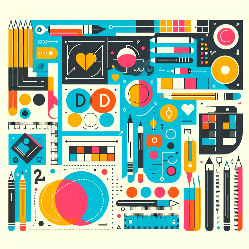
Typography in Graphic Design
Inquiry Framework
Question Framework
Driving Question
The overarching question that guides the entire project.How can we strategically use typography to design visual communications that effectively convey a message and evoke a desired emotional response in a target audience?Essential Questions
Supporting questions that break down major concepts.- How can typography enhance visual communication?
- What are the key elements and principles of typography?
- How does typography influence the perception and interpretation of a message?
- How can different typefaces and font styles evoke different emotions and associations?
- How can typography be used to create effective and visually appealing designs?
Standards & Learning Goals
Learning Goals
By the end of this project, students will be able to:- Understand the role of typography in visual communication.
- Identify and apply key elements and principles of typography.
- Analyze how typography influences message perception and interpretation.
- Explore how different typefaces evoke emotions and associations.
- Create effective designs using typography.
Entry Events
Events that will be used to introduce the project to studentsBrand Identity Rescue
A local business presents students with a failing brand identity and challenges them to revive it through innovative typography. Students analyze the brand's target audience and create a visual language that captures its essence and resonates with consumers.Portfolio Activities
Portfolio Activities
These activities progressively build towards your learning goals, with each submission contributing to the student's final portfolio.Typographic Exploration
Students explore various typefaces and their characteristics.Steps
Here is some basic scaffolding to help students complete the activity.Final Product
What students will submit as the final product of the activityA detailed chart showcasing different typefaces with annotations on their anatomy and characteristics.Alignment
How this activity aligns with the learning objectives & standardsLearning Goal: Identify and apply key elements and principles of typography.Message in a Typeface
Students select a message and choose a typeface that best conveys it.Steps
Here is some basic scaffolding to help students complete the activity.Final Product
What students will submit as the final product of the activityA presentation showcasing the message rendered in different typefaces, with a rationale for the chosen typeface.Alignment
How this activity aligns with the learning objectives & standardsLearning Goal: Analyze how typography influences message perception and interpretation.Emotional Typography
Students design a typographic poster that evokes a specific emotion.Steps
Here is some basic scaffolding to help students complete the activity.Final Product
What students will submit as the final product of the activityA typographic poster design that effectively conveys the chosen emotion through typography.Alignment
How this activity aligns with the learning objectives & standardsLearning Goal: Explore how different typefaces evoke emotions and associations.Rubric & Reflection
Portfolio Rubric
Grading criteria for assessing the overall project portfolioTypography Design Portfolio Rubric
Typographic Knowledge and Application
Understanding of typeface classifications, anatomy, and their appropriate application.Typeface Identification and Anatomy
Ability to accurately identify and describe different typefaces and their anatomical elements.
Exemplary
4 PointsDemonstrates comprehensive knowledge of various typefaces and their anatomy, providing insightful analysis and accurate identification.
Proficient
3 PointsDemonstrates thorough knowledge of typefaces and their anatomy, accurately identifying and describing key elements.
Developing
2 PointsShows emerging understanding of typefaces and their anatomy, with some inaccuracies in identification or description.
Beginning
1 PointsShows initial understanding of typefaces and their anatomy, struggling with accurate identification and description.
Appropriate Typeface Selection
Skill in selecting typefaces that align with the project's purpose and target audience.
Exemplary
4 PointsConsistently selects typefaces that perfectly complement the project's purpose and target audience, enhancing the overall message.
Proficient
3 PointsSelects typefaces that are appropriate for the project's purpose and target audience, effectively conveying the intended message.
Developing
2 PointsSelects typefaces that are somewhat appropriate, but may not fully align with the project's purpose or target audience.
Beginning
1 PointsStruggles to select typefaces that are appropriate for the project's purpose and target audience, resulting in a mismatch.
Effective Visual Communication
Ability to use typography to effectively convey a message and evoke desired emotions.Message Clarity
How well the typography enhances the clarity and understanding of the message.
Exemplary
4 PointsTypography choices enhance the message, making it exceptionally clear, concise, and impactful.
Proficient
3 PointsTypography choices support the message, making it clear and easy to understand.
Developing
2 PointsTypography choices somewhat support the message, but clarity could be improved.
Beginning
1 PointsTypography choices obscure the message, making it difficult to understand.
Emotional Impact
The degree to which the typography evokes the intended emotion or association.
Exemplary
4 PointsTypography choices powerfully evoke the intended emotion, creating a strong and memorable impact on the viewer.
Proficient
3 PointsTypography choices effectively evoke the intended emotion, contributing to the overall impact of the design.
Developing
2 PointsTypography choices evoke some emotion, but the connection to the intended feeling could be stronger.
Beginning
1 PointsTypography choices fail to evoke the intended emotion, resulting in a disconnect with the viewer.
Design Principles and Aesthetics
Application of design principles to create visually appealing and balanced typographic designs.Visual Hierarchy
Effective use of typography to establish visual hierarchy and guide the viewer's eye.
Exemplary
4 PointsCreates a clear and compelling visual hierarchy that expertly guides the viewer's eye and emphasizes key information.
Proficient
3 PointsEstablishes a functional visual hierarchy that effectively guides the viewer's eye through the design.
Developing
2 PointsAttempts to create visual hierarchy, but the organization may be unclear or inconsistent.
Beginning
1 PointsFails to establish a clear visual hierarchy, resulting in a disorganized and confusing design.
Balance and Harmony
Achieving visual balance and harmony through the arrangement of typographic elements.
Exemplary
4 PointsAchieves exceptional visual balance and harmony, creating a cohesive and aesthetically pleasing design.
Proficient
3 PointsAchieves good visual balance and harmony, resulting in a well-composed design.
Developing
2 PointsShows some attempt at balance and harmony, but the design may feel slightly unbalanced or disjointed.
Beginning
1 PointsFails to achieve visual balance and harmony, resulting in a chaotic and unappealing design.